Adding a personal touch to your CV can capture recruiters' attention in the UK job market. While no single colour guarantees success, using insights from colour psychology and industry trends can help you tailor your CV. Recruiters often prefer plain CVs, but adding them can help to make them more eye-catching, especially for creative fields. If you're not sure which one to choose, our advice? Play it safe and opt for neutral colours, such as navy blue or grey, for better readability. Check out our guide on how to write a good CV for more formatting tips.
Explore our diverse CV templates with different colour schemes you can adjust to your needs and specific industry.

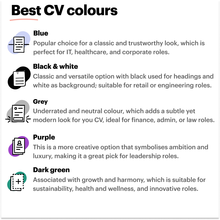
What is the best colour for a CV?
Whether you are a student, graduate, or seeking a career change, consider factors such as job type and company culture. We suggest using neutral tones, such as grey, dark blue, or black. Alternatively, lighter shades, also known as pastel colours, might be better for roles where you need to support, entertain, or motivate others, such as:
Remember to keep your CV applicant tracking system (ATS)-friendly, as recruiters use these systems to filter out the best candidates. No matter which one you choose, you only need a polished CV with clear headings and a clean format without heavy graphics.

Before writing your CV and choosing a colour, consider creating a master CV to streamline the process and tailor your application to specific job requirements.
Top tips for choosing the best CV colour
Discover the best strategies for selecting the best colour for a CV using the four simple tips below:
1. Adhere to a colour scheme
It’s best to adhere to a consistent scheme. Opt for those that combine well and create a visually appealing design. Avoid using too many contrasting colours that could distract from your content or make the CV difficult to read. Aim for a palette of two to three to maintain a polished and professional look.
Examples of good colour combinations for a CV:
Black and white with a touch of blue: Black and white with subtle blue shades convey professionalism, symbolising trustworthiness, as shown in the civil service CV.
Grey and burgundy: Neutral grey is neutral, and burgundy adds warmth. This combination could spark interest yet look professional, as displayed in the data scientist CV.
Navy blue and light grey: Navy blue is classic, and light grey adds a soft touch, which applies to diverse job types, as shown in the barista CV.
2. Match the colours with the company’s website
Consider the industry and company culture when deciding on the scheme for your CV. For example, if you're applying for a creative role in the advertising or graphic design industry, you may opt for bold, eye-catching colours, showcasing your creativity. However, if you're applying for a more traditional or corporate position, it's best to stick to neutral tones like black, navy, or grey to convey professionalism and reliability. Knowing your target audience is especially useful for those candidates with no experience.
Twitter (X): primarily blue and white, which emphasise the company's focus on communication and information.
Amazon Web Services (AWS): bright orange colour in combination with blue and black, reflecting the company's goal to drive innovation and improve cloud computing.
Twilio: the focus is on deep purple, which is associated with luxury and creativity.
Atlassian: black and white scheme with blue and orange accents, which creates a professional look.
Refer to our accountant, architecture, and computer science writing guides for more examples of tailoring your CV to a specific job and the company's website.
3. Ensure the content is easy to read
While adding colour to your CV can make it visually appealing, ensuring the content is readable and comprehensive is key. Choose those for the text and background that provide sufficient contrast to enhance readability. For instance, if you have a dark background, use light-coloured text, and vice versa. Avoid using overly bright or neon shades that may strain the eyes or make the text difficult to discern.
Refer to our blog article on how to improve your CV for more tips and practical examples.
4. Use standard formatting
Regardless of your chosen palette, adhere to standard formatting practices throughout your CV. This includes using a clear and legible font, consistent spacing, and logical organisation of sections. The colour should enhance the overall design without overshadowing the content. Stick to traditional fonts like Arial, Calibri, or Times New Roman for the main body text, and reserve decorative fonts for headings or section titles if necessary.
For more tips and examples, refer to our similar blog article on the best font for a CV.
Best colourful CV templates
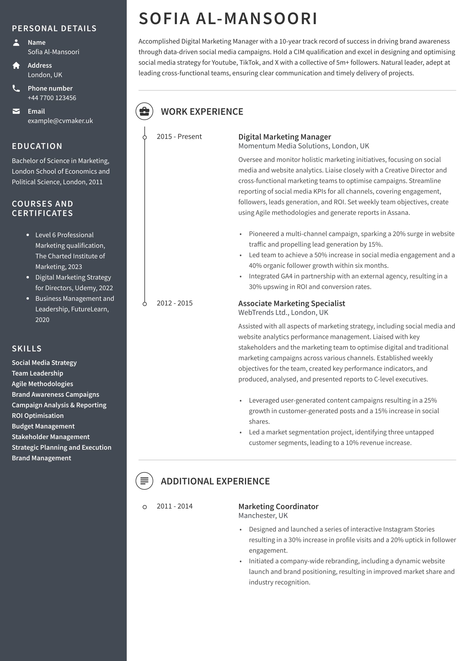
Solid block grey template

Download this digital marketing CV sample in PDF
In this CV sample, Sofia combines dark grey and white on her CV with a simple design. It is well-structured with easy-to-read font and clear headings. Two background colours add up to a cohesive and professional look with no heavy graphics or overwhelming schemes, making her an ideal fit for the role.
Splash of yellow template

Download this graphic designer CV example in PDF
This CV sample features Emily, a graphic designer, who strategically opted for a bright one-column template with white, black and yellow colours. This is a good choice for agencies or creative industries, where you must present your personality and unique traits.
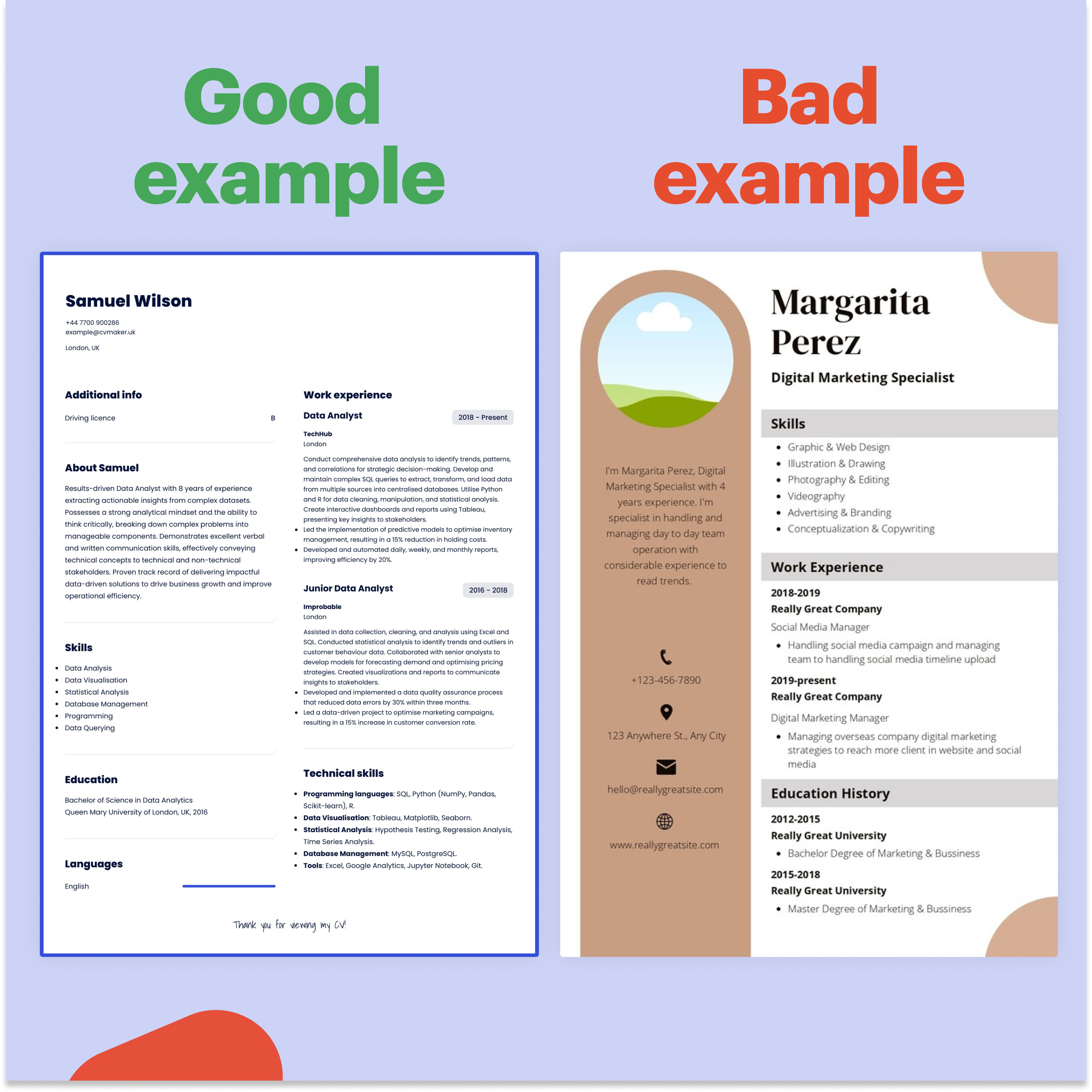
Blue frame template

Download this data analyst CV sample in PDF
This CV example shows Samuel, a data analyst passionate about numbers and data-driven solutions. He uses a simple two-column format with black and white colours and a dark blue frame. Doing so adds a personal touch to his CV while maintaining a professional layout. This wise combination sets him apart from other similar candidates.
What to avoid when choosing a colour on a CV?
It’s best to avoid excessive graphics that can clutter your CV and distract hiring managers from the main content. These could include level bars, graphs, tables, or figures. While visual elements can enhance your CV, too many can overwhelm the reader and make navigating difficult. Instead, opt for a clean and minimalistic design that is easy to read and has clear formatting, such as graduate, customer service, and marketing.
Examples of contrasting colours to be cautious of on a CV:
Black and bright red: While black offers a classic foundation, bright red emphasises key sections or headings more. But avoid using red excessively, as it may give an unprofessional impression.
Navy blue and orange: Navy blue is professional, and orange adds vibrancy and creativity. Only use orange to highlight the main parts of your CV.
Dark grey and teal: Dark grey looks classy, and teal adds a modern touch. Be cautious not to overuse them to ensure it is easy to read.
Examples of colour combinations to avoid in a CV:
Bright red and neon green: This combination could strain the eyes, making your CV look unprofessional.
Dark purple and navy blue: These two might blend, making it hard to see between different parts of your CV, requiring extra effort to understand.
Yellow text on white background: Yellow text on a white background can be challenging to read, especially for colour-blind people, which makes it easier to overlook important information on your CV.
Clashing neons: Combining different neon variations can make your CV messy and unprofessional, distracting the recruiter from the main content.
High contrast black and white: While black and white look classy, excessive contrast can be hard to read, especially in long CV sections such as work experience or education.

Key takeaways
Following our tips, you can confidently choose the best colours for your CV to enhance its visual appeal while maintaining readability and professionalism. Ensure to tailor your CV to a specific job while keeping it coherent and easy to read. Remember, colour choice is usually not a deciding factor for recruiters. Hence, we suggest you prioritise clarity and plain format to align your CV with the expectations of your target industry.

Next steps?
Once you've determined the ideal colour scheme and layout for your CV, the next crucial step is to ensure it's both visually appealing and ATS-friendly. Explore our services below, designed to provide professional support tailored to your needs:
CV Builder: Access diverse CV templates to help create a tailored and well-formated CV.
Cover letter builder: apply with a matching cover letter template with a clear layout so you can easily personalise and adjust to your career goals.
CV writing service: connect with one of our experts to receive feedback and get quick, professional advice on tailoring your CV to a specific job.
Blog: see our guides and brief articles to educate yourself on the best strategies to improve your job prospects.
The next step in the application process is preparing a list of good questions for an interview.
FAQs
What are the best industries for using a colourful CV?
Graphic design, marketing, and fashion industries often appreciate colourful CVs showcasing creativity and individuality. On the other hand, law firms or engineering industries may prefer conservative ones such as navy blue or black. However, it's essential to research the specific company culture to ensure the shades align with your employer’s expectations.
See the fashion design and marketing CV writing guides for more inspiration.
What is the most attractive colour for a CV?
The looks of a CV largely depend on various factors, including personal preference, industry standards, and readability. If you're stuck, choose safe and neutral options like navy blue or charcoal grey. Adding colour is not a problem, but ensure your CV is tailored to your job and conveys your ideas visually and in words.
What is the psychology of colour for CVs?
Colours evoke various emotions, influencing how employers perceive your CV. For example, blue conveys trustworthiness and professionalism, while green suggests growth and innovation. Consider the message you want to convey and choose the appropriate combination accordingly.
What colour is most likely to get you hired?
While no specific colour guarantees a job, using a clean, professional palette can positively impact employers' perceptions of your CV. Remember, you cannot go wrong about neutral tones like black, navy blue, or charcoal grey, as they are safe options and widely accepted by employers.
Explore our colourful and plain CV examples based on job and industry to help you make the right choice!

)


)

)
