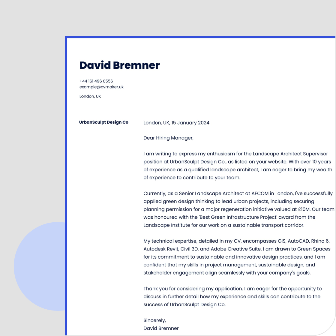
Whether you are a school leaver, student, or changing career, selecting the appropriate font for your cover letter might seem trivial, yet it is essential in shaping how employers perceive your application. In a good cover letter, your font choice demonstrates professionalism, attention to detail, and understanding of key requirements. Although the font can create a strong first impression, the content of your cover letter is what truly matters when submitting your application.
In this guide, we cover:
Top-notch cover letter fonts and templates (check out CVMaker for more!).
Pro tips when choosing a cover letter font.
Common mistakes to avoid.
Pros and cons of most popular fonts and font sizes.
How to pick a professional font when you're new to the game.
Explore our diverse collection of cover letter templates to help you find the perfect match for your career needs.

Top 10 cover letter fonts to use
Here's a list of safe and reliable fonts you can use for your cover letter:
Arial: Classic, clear, versatile.
Calibri: Modern twist on a classic, good readability.
Cambria: Elegant, sophisticated, professional.
Garamond: Timeless, charming, classic feel.
Georgia: Similar to Garamond, a blend of classic and modern, easy on the eye.
Helvetica: Clean, minimalist, contemporary (sans-serif)
Open Sans: Open-source, clear, readable.
Avenir: Modern, stylish, suitable for creative fields.
Times New Roman: Traditional, widely recognised, possibly overused.
Verdana: Similar to Arial, a clear, spacious, and good for on-screen reading.
Pro Tip
Avoid overly decorative and hard-to-read fonts as they can distract from your main content. These fonts may also pose issues with applicant tracking systems (ATS) used by many industries. Opt instead for clean, professional fonts like Arial, Calibri, or Times New Roman to ensure clarity and enhance your chances of leaving a positive impression.
What are the main types of cover letter fonts?
There are two main types of cover letter fonts: serif and sans-serif. The former has a more traditional and formal look, characterised by tiny strokes at the end of each character. On the other hand, the latter is more recognised for its sleek and modern look, making them ideal choices for creative positions or career documents.
Serif:
Times New Roman
Georgia
Garamond
Baskerville
Didot.
Sans-serif:
Helvetica
Arial
Roboto
Lato
Verdana.

As shown in the image above, there are three other fonts, specifically monospaced, script, and display. We suggest avoiding them as they are hard to read and can look unprofessional.
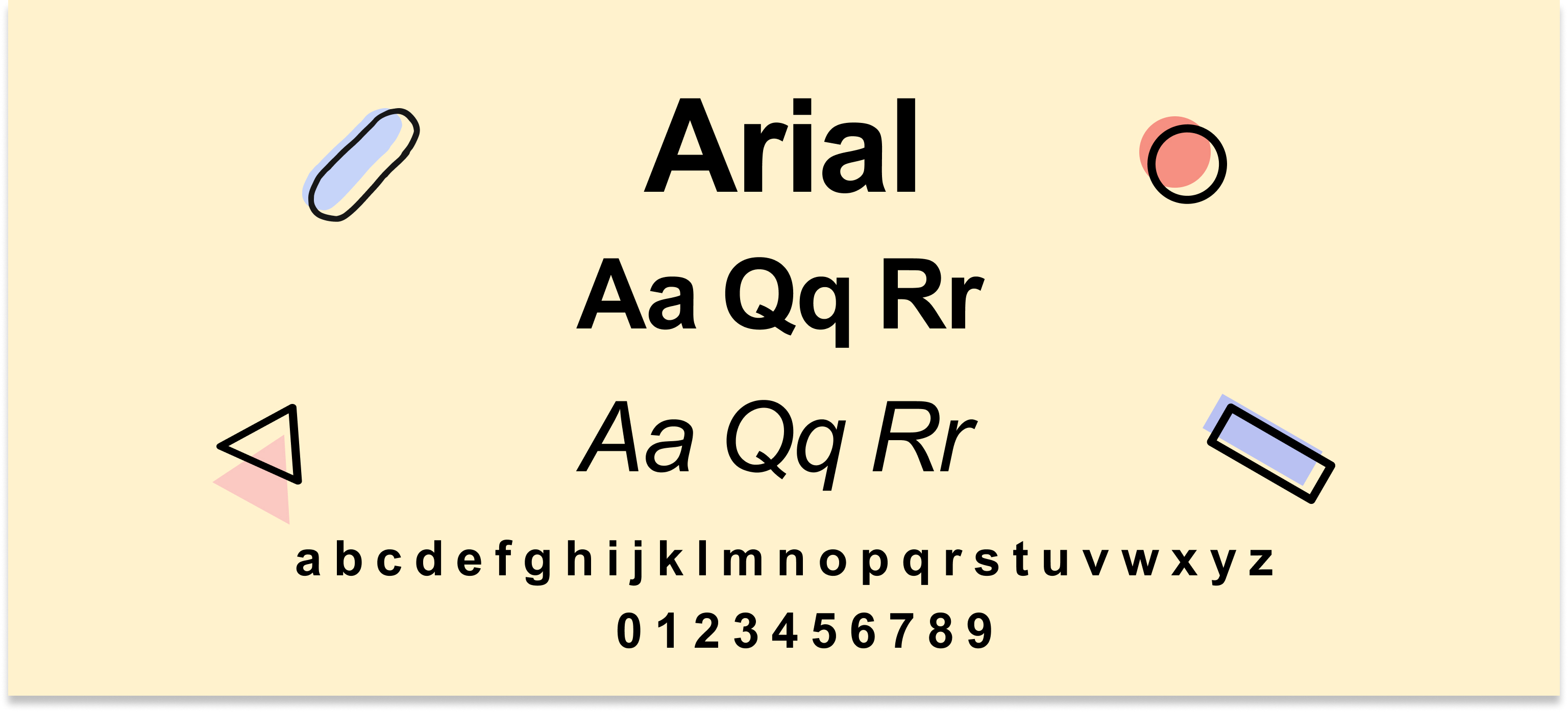
1. Arial
Arial is a contemporary sans-serif font known for its simplicity and clarity. Its clean lines and straightforward design make it an excellent choice for professional documents, ensuring readability both on screen and in print. It's ideal for corporate settings, such as finance, IT, and law. It's a strong choice for industries cherishing efficiency and accuracy.
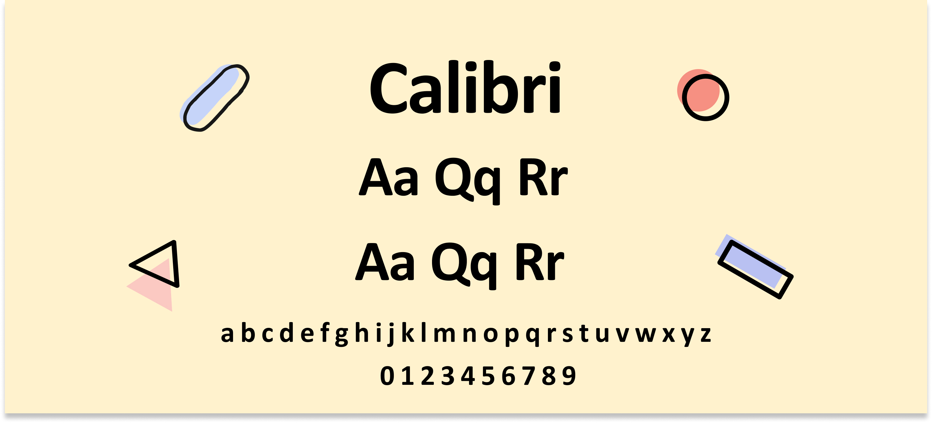
2. Calibri
Calibri is a modern sans-serif font that has become the default typeface for Microsoft Office. With its rounded letters and soft appearance, it brings a friendly yet professional tone to any document, making it ideal for cover letters. Calibri is often used in HR, customer service, and teaching. Its soft lines are suitable for roles requiring interpersonal skills.
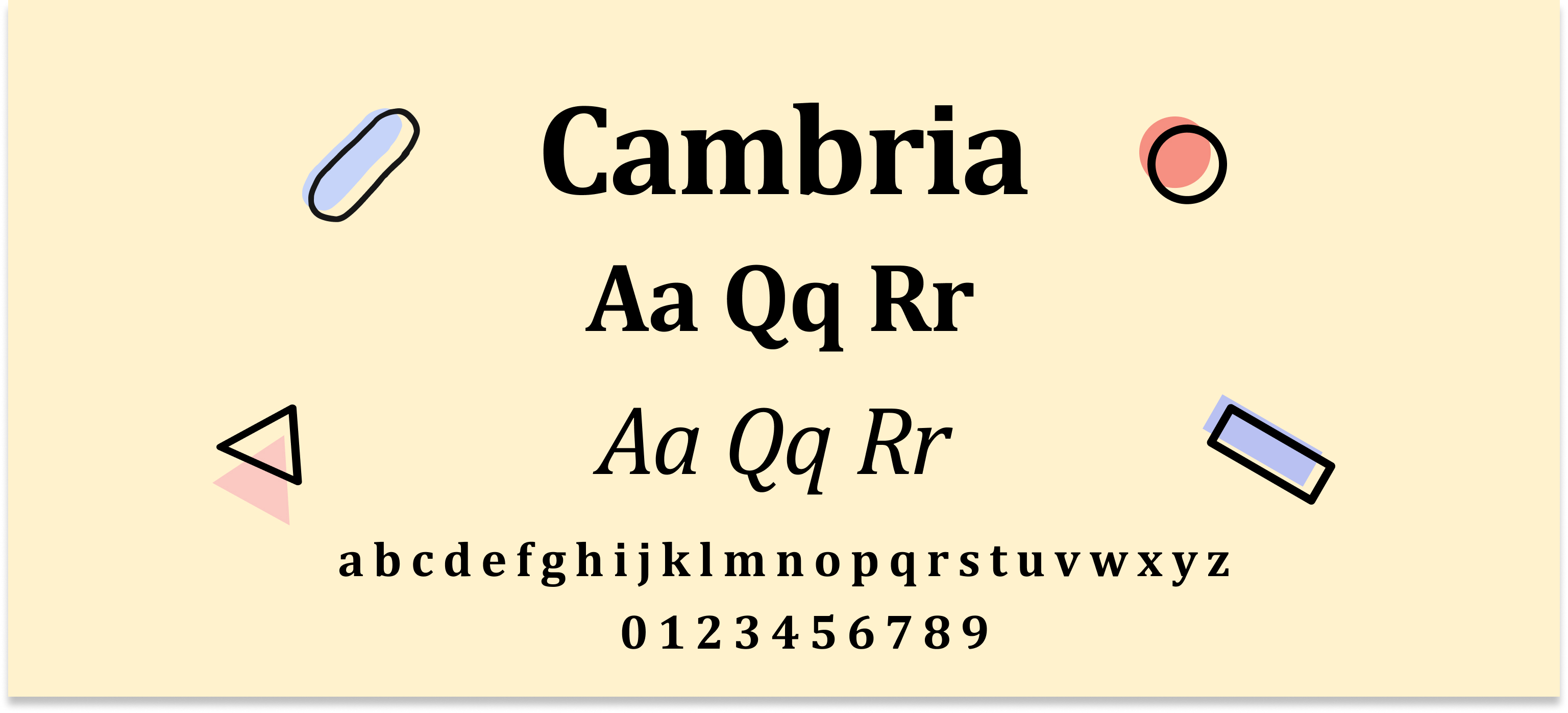
3. Cambria
Garamond is a timeless serif font that exudes classical beauty and charm. Often used in high-quality publications and literary works, it lends an air of prestige and sophistication to cover letters and other formal writings. Cambria is suited for industries requiring credibility, making it an excellent choice for roles in academic or legal jobs like paralegal.
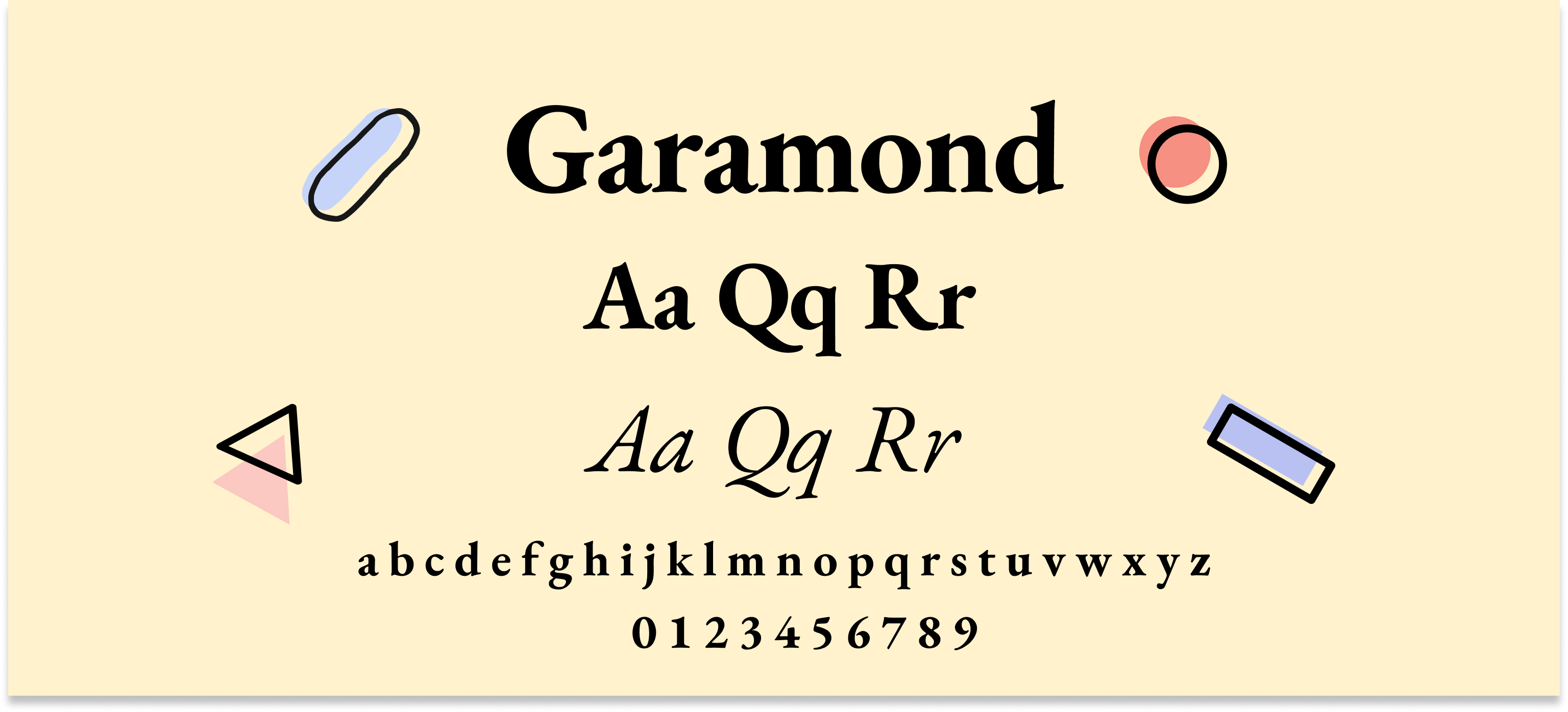
4. Garamond
Garamond is a timeless serif font that exudes classical beauty and charm. Often used in high-quality publications and literary works, it lends an air of prestige and sophistication to cover letters and other formal writings. It is suitable for creative roles like fashion designer, writer, journalist or for professionals working inluxury brands.
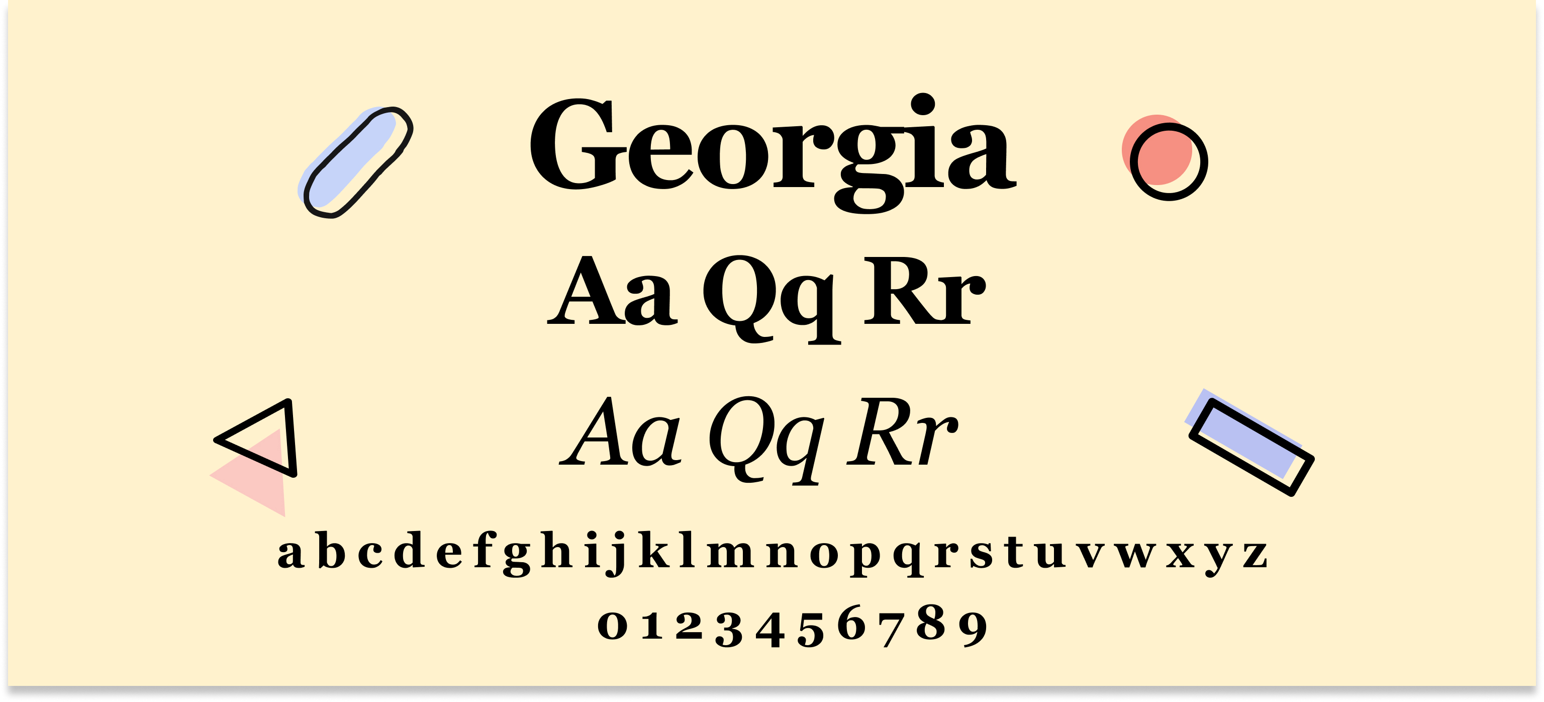
5. Georgia
Georgia is a serif font celebrated for its excellent readability, especially in smaller sizes. Its blend of traditional and modern elements makes it a versatile choice, suitable for both creative and professional documents. It is ideal for publishing, marketing, and developers.
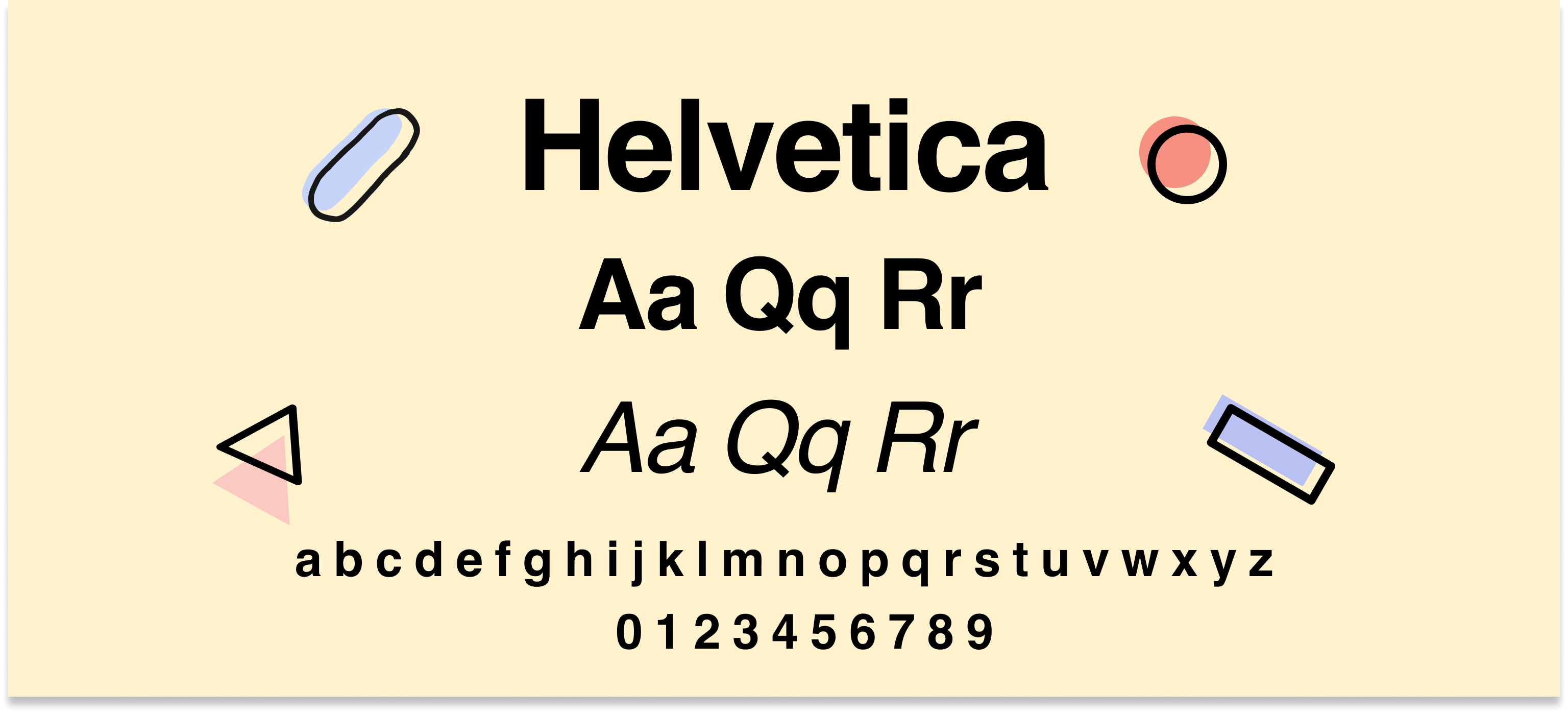
6. Helvetica
Helvetica is an iconic Swiss sans serif font renowned for its clean, neutral design. Its widespread use in corporate branding and signage highlights its professional appeal, making it a reliable choice for business-related documents. It is a also great fit for corporate branding, banking, and technology.
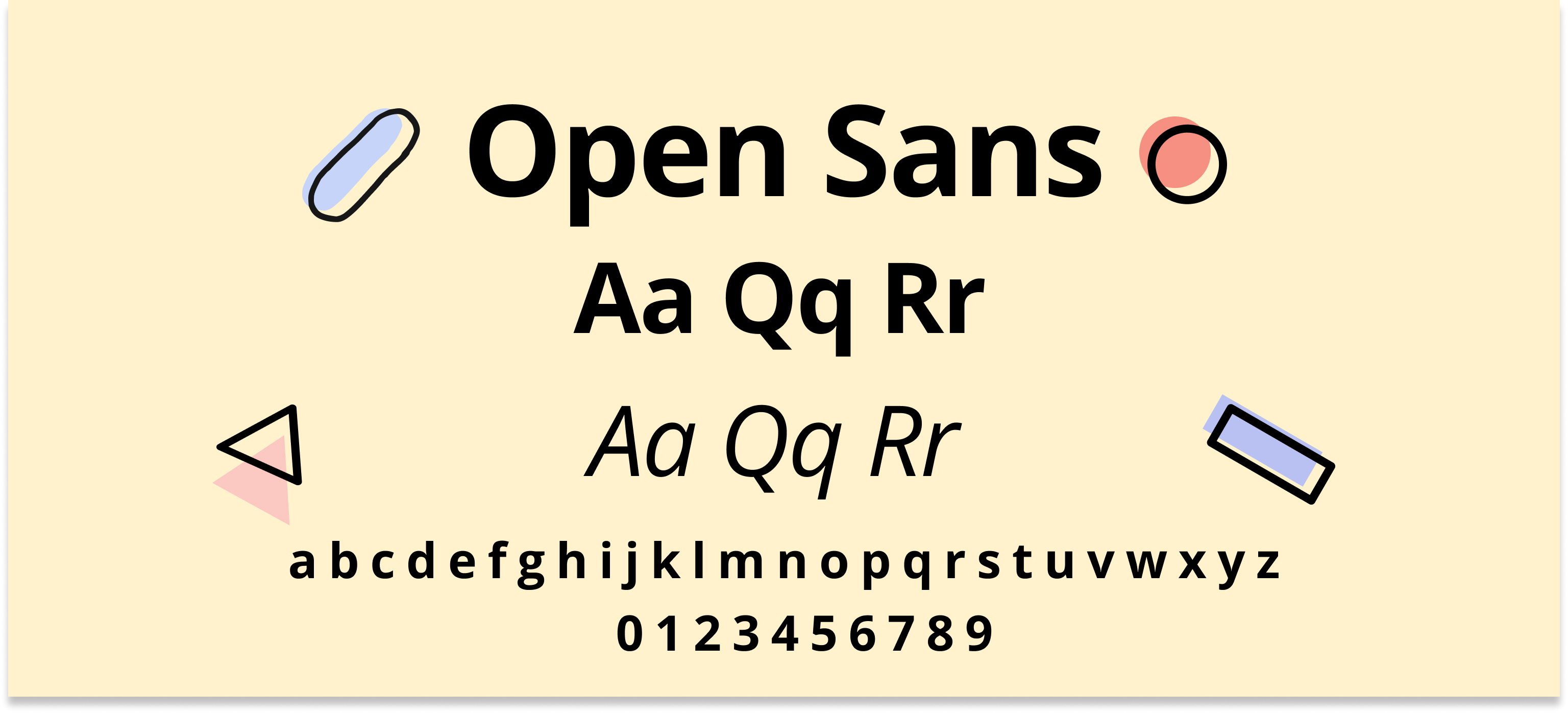
7. Open Sans
Open Sans is a humanist sans serif font developed by Google, prized for its approachable and friendly appearance. Its clear and versatile design ensures it looks good on both screens and paper, making it a great option for cover letters.It's a great match for tech, e-commerce, and non-profit sectors.
8. Avenir
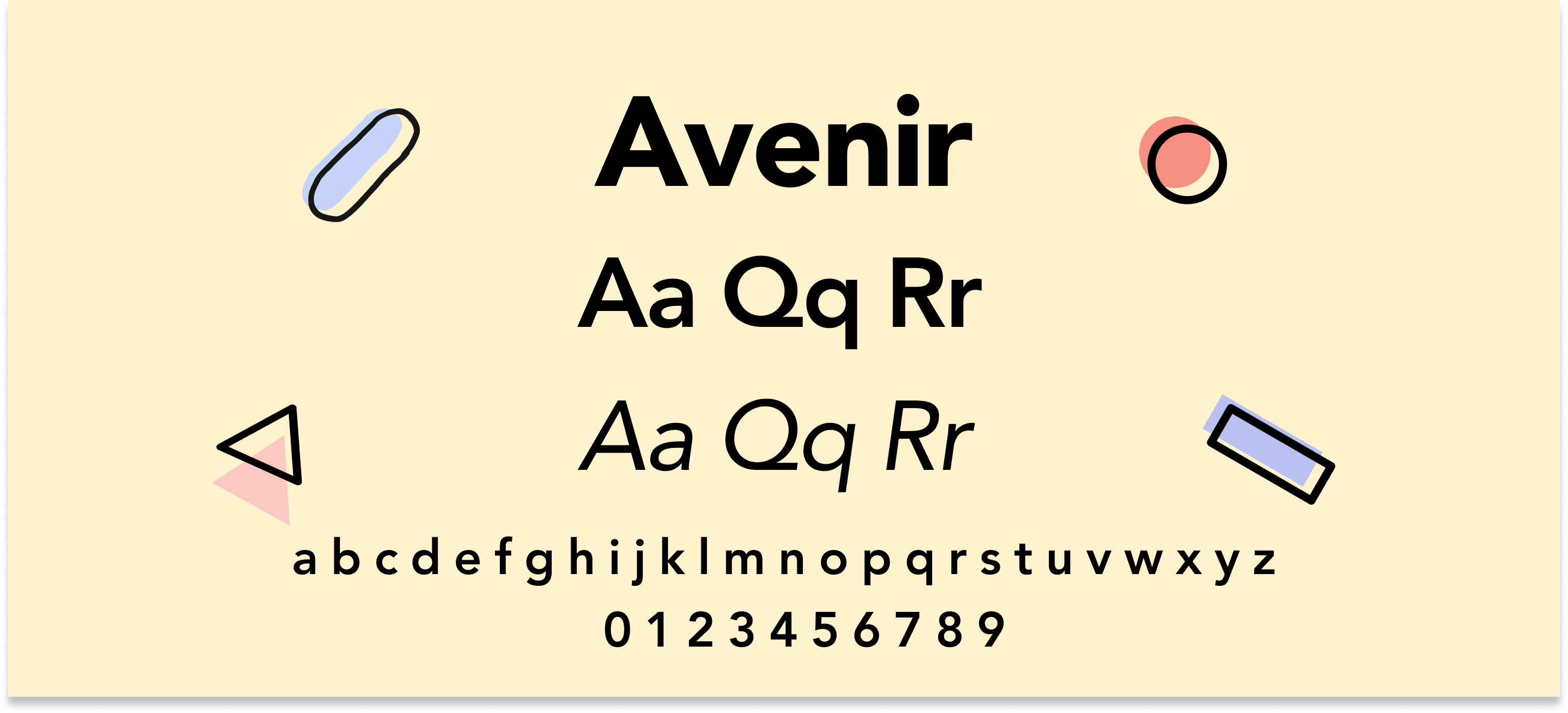
Avenir is a geometric sans serif font that combines modern aesthetics with classic principles. Its sleek and elegant lines make it a popular choice for branding, design projects, and professional documents aiming for a contemporary look. This font is great for fashion, architecture, and technology brands.
9. Times New Roman
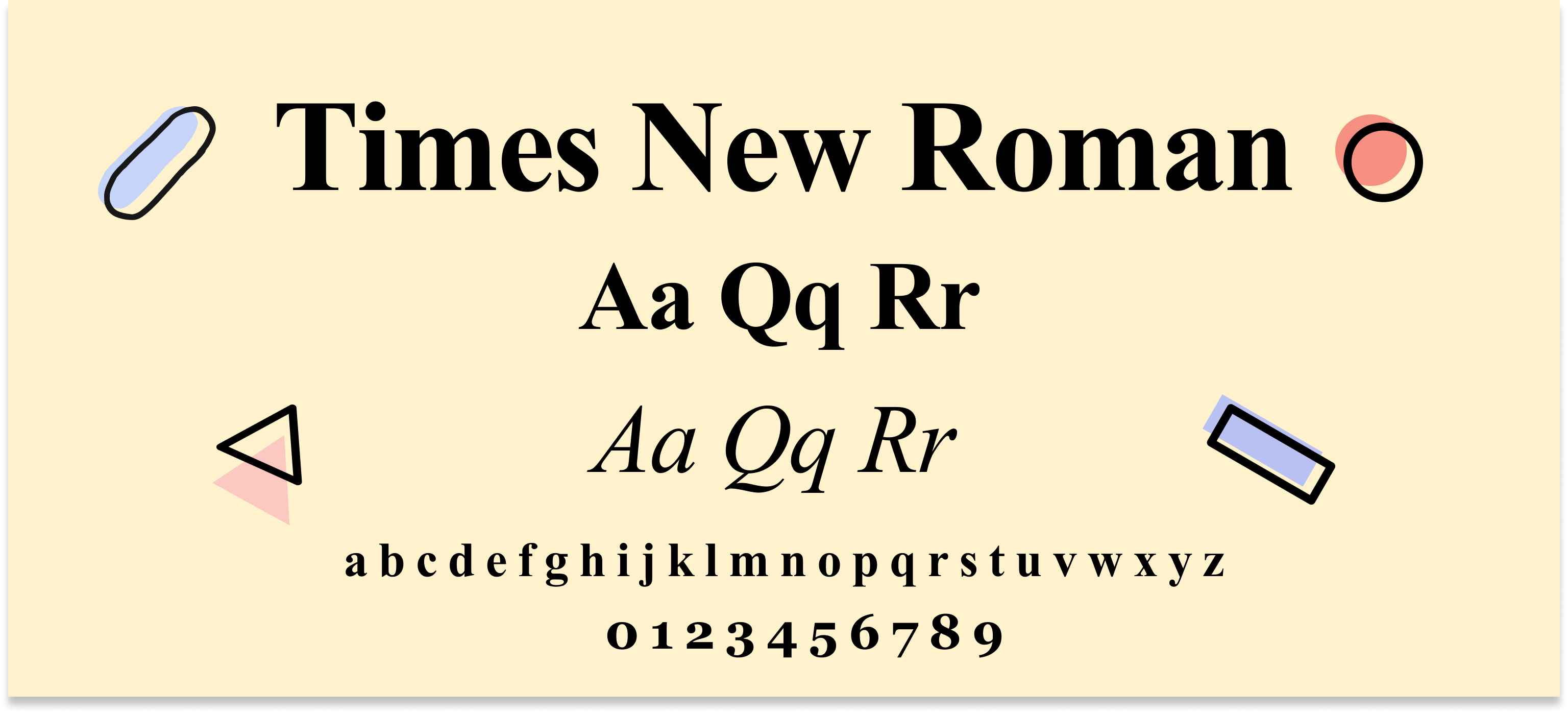
Times New Roman remains a stalwart in the world of fonts, known for its classic serif style. It is particularly favoured in traditional sectors such as law, academia, and government, providing a sense of formality and reliability.This font is appropriate for law, academia, and civil service roles.
10. Verdana
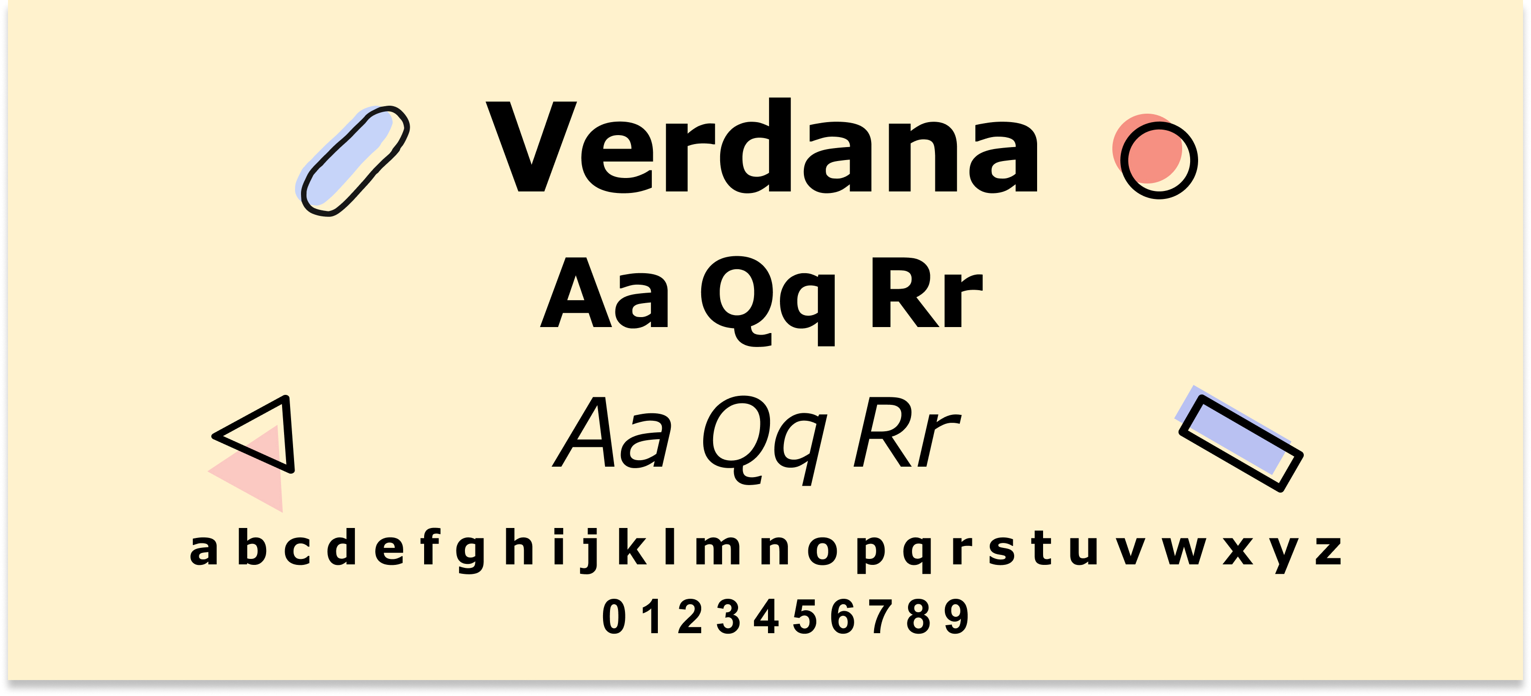
Verdana is a sans serif font created for optimal readability on screens, featuring wide spacing and a large x-height. Its relaxed yet professional appearance makes it suitable for digital documents and presentations. Verdana is a great choice for IT, e-commerce, education, and sofware development.
What is the best font and size for your cover letter?
Pick an easy-to-read, attractive, and clean font, such as Times New Roman, Garamond, or Georgia. Opt for a font size between 10 and 12 points, ensuring your message is clear and not overwhelming for the hiring manager. By choosing the right font your cover letter will speak for itself and would leave a positive impression on the overall look and legibility.
Classic choice: Play it safe and opt for ATS-friendly fonts like Arial, Calibri, or Verdana, ensuring you follow the industry requirements and write your message clearly to recruiters.
Right size: if you have a detailed cover letter or CV, we recommend going for a font size 10, whereas a font size 12 could be a better fit for a more simple and standard feel.
Consistency is key: Before submitting your application, ensure it matches your CV and looks professional across your entire application.
Take a look at our related blog article on the best font for a CV to learn more.
What fonts to avoid on a cover letter?
Although fonts can help you maintain a professional look, some fonts could harm your chances of landing a job interview. At first, it may seem like a minor change, but fonts can make your text hard to read and appear unprofessional.
Avoid the following types of fonts to ensure high readability!
Ornate fonts: Elaborate swirls and intricate designs can be difficult to read, making your information look cluttered.
Cursive fonts: They typically mimic handwriting and can be challenging to read, making your application look informal.
Uppercase fonts: Recruiters can view it as shouting, making it harder to scan your cover letter quickly. Rather leave caps for headings or official titles.
Remember, the key is to match your cover letter with the job description and career goals. Doing so can boost your chances of getting noticed and possibly landing your first job interview.
What mistakes to avoid when adding font on a cover letter?
Whether you're applying for an internship or need a short cover letter, choosing the right font and formatting it correctly is essential. See below how to avoid common mistakes:
Font soup: Avoid mixing fonts; rather, stick to one professional font for the entire document to create a clean look.
Inconsistent sizing: Maintain consistency for high readability and optimisation for applicant tracking systems (ATS).
Unreadable colours: Black or dark grey text on a white background is safest.
Bold & Italic overload: Use bold only to highlight key points and italics for titles, achievements, or quotes
Mobile mishap: Ensure your font is readable on a smaller screen, such as tablets or phones.
If you’re still early in your career, refer to our related blog article on how to write a cover letter with no experience.
Top tips for choosing the best cover letter
1. Align your font choice with the company culture
Taking the time to research the company you're applying to demonstrates your genuine interest and attention to detail. If their website and branding have a minimalist aesthetic, consider a more modern font for your cover letter. For a company with a more traditional culture, a classic font is a safe and reliable choice.
Research the company brand: Consult the company's website and social media to get a sense of how they present themselves
Modern company, modern font: For companies with a modern look, think about fonts like Proxima Nova or Helvetica.
Traditional company, classic font: Go for classic fonts like Times New Roman or Garamond for companies with a more traditional culture.
A well-chosen font can subtly reflect your suitability for the position you're applying for. For instance, in creative fields like marketing or design, a slightly bolder font can showcase a touch of personality. However, in traditional industries such as law, finance, or accounting, classic fonts convey a sense of trust and reliability.
For more insights on aligning your cover letter with company culture, see how to write a CV for the first job.
2. Prioritise readability
It is crucial to ensure your cover letter is easy to read. Avoid decorative fonts that may be visually appealing but struggle with on-screen clarity. Remember, a clear and concise message is more likely to capture a recruiter's attention.
Choose clear and crisp fonts: Go for fonts like Arial, Calibri, or Verdana, which are known to be easy to read and reliable choices.
Avoid decorative or script fonts: Avoid over-decorative or cursive fonts, as they can be difficult to read on a computer or mobile screen.
Maintain proper font size: Aim for a font size between 10 and 12 points. A 10-point font works well with extensive cover letters, while a 12-point font gives a more spacious look.
For additional guidance, refer to our related blog article on the best colour for a CV.
3. Keep it simple
Maintaining a consistent and professional tone throughout your cover letter is essential. Using multiple fonts or styles can create a cluttered and confusing visual experience for the reader. Stick to a single, professional font to ensure a clean and polished look.
Clean and simple: Use one professional font throughout your entire cover letter to create a neat and polished look.
Avoid mixing styles: Do not combine fonts like bold, italic, or underline, within the body text. Utilise them strategically for emphasis (e.g., headings, job titles).
Match your CV font: Ensure consistency between your cover letter and CV font for a unified application package.
For more expert tips, refer to our related blog article on how to improve your CV.
4. Proofread carefully
A flawless application shows professionalism and attention to detail. Take the time to proofread your cover letter carefully and ensure there are no typos or errors. Additionally, double-check that your chosen font size and style are consistent throughout the entire document.
Double-check for typos and errors: Proofread your cover letter thoroughly for any typos or grammatical errors that could detract from your professionalism.
Coherent overall look: Ensure your chosen font size and style are consistent throughout your career documents.
To ensure your cover letter is error-free and tailored to the job, check out our CV Writing Service for further guidance.
5. Consider font size and style
Consider using italics or bold text to highlight key information or achievements without overwhelming the hiring manager with too many highlights. Understanding the job's demands is key to formatting your cover letter effectively.
For more tips, see our additional article on how to place and highlight action verbs on a CV.
Use italics for emphasis: Use italics to emphasise specific words or phrases.
Use bold for headings: Apply bold for headings, subheadings, or important points.
Keep a consistent look: Ensure bold and italics enhance the design without distracting.
For more tips on the best format and layout, explore our CV examples for inspiration.
Cover letter templates with the best fonts
See below the best cover letter templates with a professional font.
Designer cover letter example
Download this designer CV example in PDF
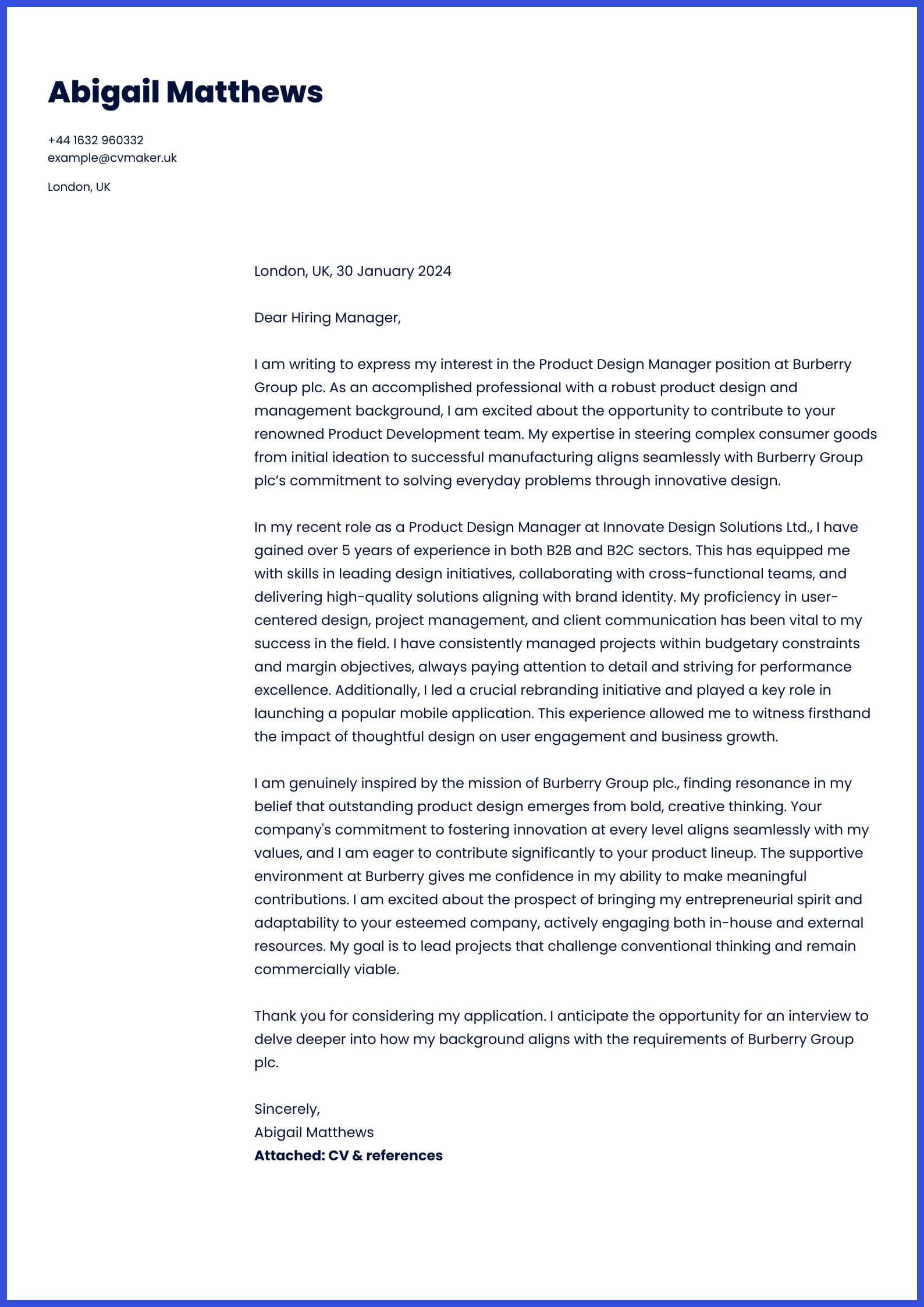
This cover letter sample features Abigalil, highlighting her relevant design expertise and showcasing her ability to maintain high standards as a Product Designer. This cover letter follows a simple layout, matching the chosen CV template. For more details, check out one of our articles below:
Marketing cover letter example
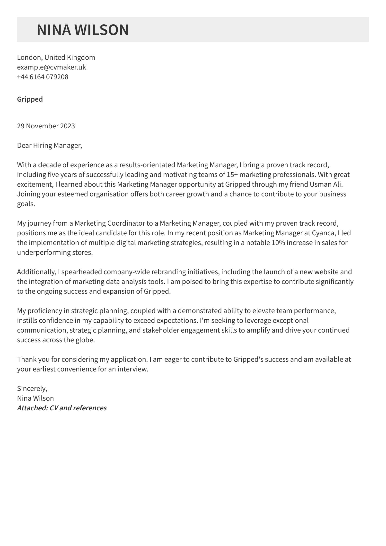
Download this marketing cover letter sample in PDF
In this example, Nina strategically presents her skills and achievements, positioning herself for a high-impact Marketing Manager role. This cover letter is modern, aligning seamlessly with her marketing CV example. It follows a clear layout with concise language and a professional Source Sans Pro font. By strategically incorporating hard skills and career accomplishments, she positions herself as a qualified candidate with an impressive track record of leading and inspiring teams.
For more inspiration, refer to the related articles below:
Student cover letter example
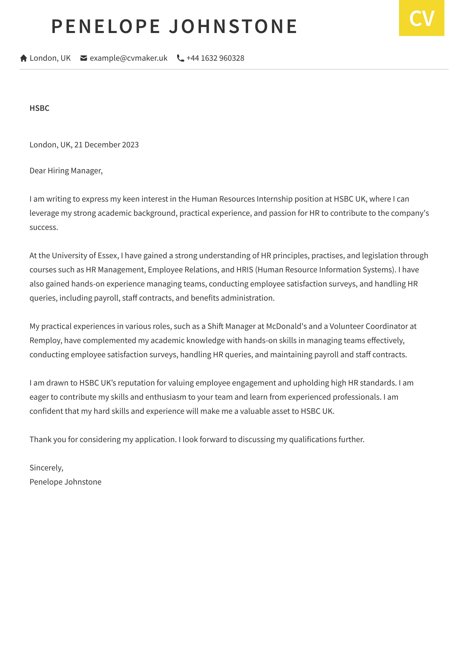
Download this student cover letter in PDF
This cover letter sample features Penelope, a diligent Business Psychology student. It showcases her academic achievements and extracurricular involvement, aligning them with the position's requirements. The cover letter follows a modern style, keeping it concise and tailored to the specific job.
For more inspiration, refer to our related step-by-step guides below:
IFor more support, check out our related articles on how to explain unemployment on a CV and seasonal work opportunities in the UK.
Key takeaways
Although the well-chosen font can make a strong initial impression, remember that content should be your real focus. See our key takeaways from the article below:
While a great font can make a good first impression, remember your content is the key!
Play it safe with classic fonts like Arial, Times New Roman, or Verdana.
Your font choice shows attention to detail and professionalism.
Make sure your font matches the job requirements and company brand.
By using our guidelines and picking the right font, you can write a strong cover letter that eludes professionalism and high readability.
Next steps?
When your mind is at peace with your cover letter colour, it’s time to update the content of your cover letter ensuring all the information is up to date and meets your recruiter’s needs. Whether you’re not sure how best to describe your experience or what information to include in your cover letter, consider checking out one of our related blog articles below:
FAQs
What is a go-to font for CVs and cover letters?
Common choices like Calibri, Arial, and Times New Roman are preferred for their readability and professional appearance. For a touch of sophistication, consider Garamond or Georgia.
Is Sans-serif or Serif more professional?
Serif fonts are generally seen as traditional and formal, whereas sans-serif fonts offer a clean, modern look. Ensure that your choice reflects industry standards and personal preference.
Are there fonts I should avoid on my cover letter?
Avoid using small fonts like size 6 or 8, as well as overly large fonts such as size 14 or 16. Opt instead for a font size between 10 and 12 points, striking a balance that ensures readability without sacrificing space. Remember, your font choice should not detract from your recruiter’s ability to focus on your main content.
Can I use different fonts for my cover letter and CV?
It’s best to use consistent fonts across your cover letter and CV to maintain a cohesive look. This approach helps create a strong first impression.
How do I format my cover letter?
Use a clean and simple format with clear headings and sufficient white space. Stick to one font, use consistent spacing, and avoid excessive formatting. Ensure your cover letter is tailored to the job and company you're applying to.
For more tips, check out the best format for a simple CV and modern CV.

)


)

